Using custom CSS
Prosper planEnterprise plan
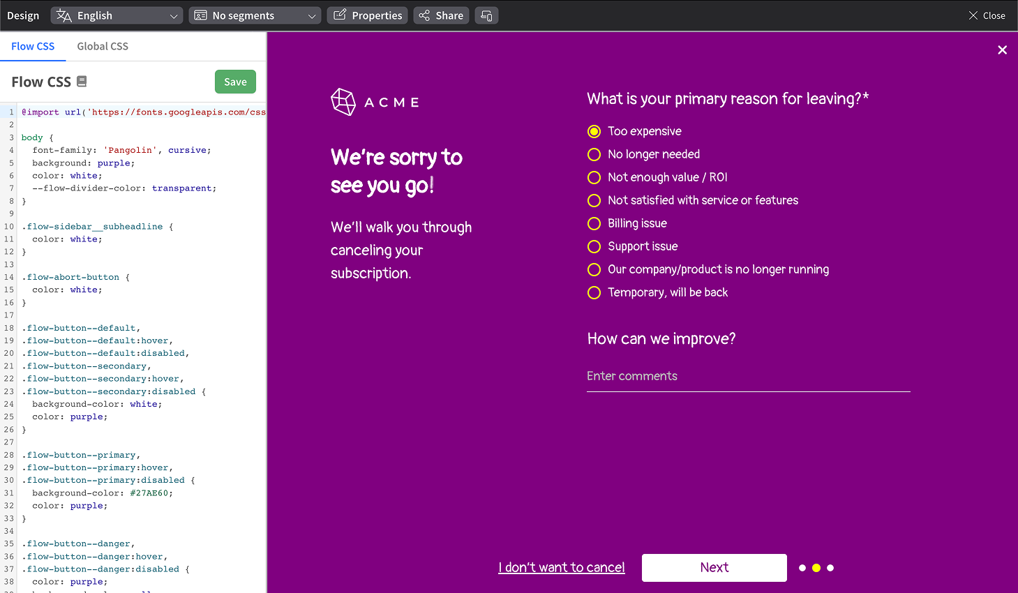
The out-of-the-box ProsperStack flow fits great on most websites, but with custom CSS you can change the flow's look and feel to completely match your brand.

Opening the Custom CSS panel
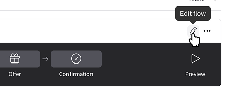
To access the Custom CSS panel, enter the flow editor by clicking Flow in the left navigation and then the pencil icon in the flow steps diagram.

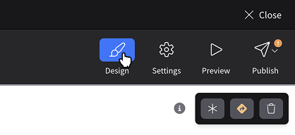
In the flow editor, click Design in the upper right of the flow editor.

Flow and global CSS
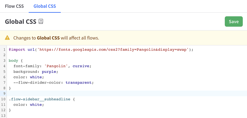
By default, custom CSS will apply only to flow you're editing. To edit global CSS, switch to the Global CSS tab in the CSS editor. Any changes made to CSS in the Global CSS tab will apply to all flows.

Saving changes to Global CSS will take effect immediately. Changes to Flow CSS will apply to your draft flow and will not take effect until published.
Guidelines
Due to the complex responsive structure of the flow layout, some elements should not be modified with custom CSS.
Class names beginning with flow- are provided for custom CSS targeting.
Automatically-generated class names like hHVQZU should not be targeted
with your custom CSS. These class names are subject to change at any time.
In the following example, only .flow-sidebar should be targeted by your custom
styles.
<div class="sc-1pergwl-5 hHVQZU">
  <div class="flow-sidebar">...</div>
</div>
When extra specificity is needed, html body .flow-* {} can be used. Do not
rely on other structural elements that don't have a flow-* class, as these are
subject to change.
BEM methodology
Class names adhere to the BEM (Block Element Modifier) methodology.
<button class="flow-button flow-button--danger">
  <div class="flow-button__content">Cancel subscription</div>
</button>
In the example above, flow-button is a block, flow-button__content is an
element, and flow-button--danger modifies the presentation of the block.
Changing fonts
Fonts can be included with the @import rule.
Example using Google Fonts:
@import url("https://fonts.googleapis.com/css2?family=Pangolin&display=swap");

body {
  font-family: "Pangolin", cursive;
}
Changing the divider bar color
The color of the divider bar is referenced in multiple elements. A CSS custom
property, --flow-divider-color, is used for convenience.
body {
  --flow-divider-color: lightgray;
}
Changing button colors
Buttons in the default theme have three states (default, :hover, :disabled)
and come in four varieties (modifiers):
.flow-button--default- e.g. "Next" button.flow-button--primary- e.g. "Accept offer" button.flow-button--danger- e.g. "Cancel subscription" button
An example reset for the default button:
.flow-button--default,
.flow-button--default:hover,
.flow-button--default:disabled {
  background-color: inherit;
  color: inherit;
}